Some weeks ago I released the latest iteration of this, my personal, homepage. With the homepage refinement a redesigned statistic center has also been published. I already had a blog post about the first statistic center, which can be found in the references. The good part about the old center was the cleanness, however, it also had some severe flaws. Especially the heatmap was very hard to control, which was the main reason for stopping data mining a short while after the launch.
Even with the heatmap being disabled, the request data did not stop growing. A couple of months later I had several hundred megabytes in raw data, which was already too much to handle efficiently. Now I preprocess some of the data, which gives me a good compromise between flexibility and performance.
The reasons for stopping the heatmap data mining are simple, but maybe part of another post with more details on how to construct a much more efficient system that also scales much better.
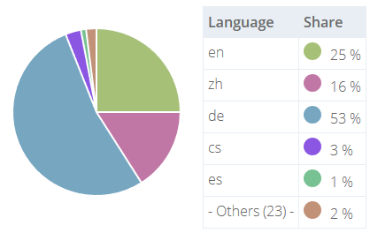
So what kind of statistics can I offer now? Of course I did not loose any of the previous statistics, which would have been a nightmare. For instance I can directly see that it made sense to start posting purely in the English language.
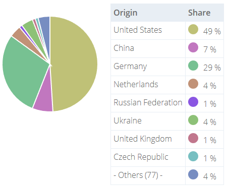
This makes even more sense if we have a short look at the origins, i.e. the country of the various visitors. So people from the USA are after all frequent visitors.
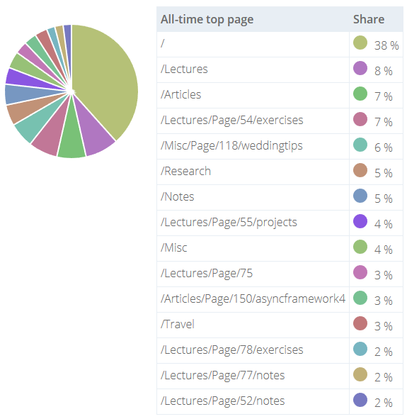
Time to look behind the curtain. What kind of pages are high in demand? Of course the landing page must be on the top spot. It is the entry point of the page and certainly the number 1 exit spot. Otherwise it is the door for another page, which then can only come in second place, tops.
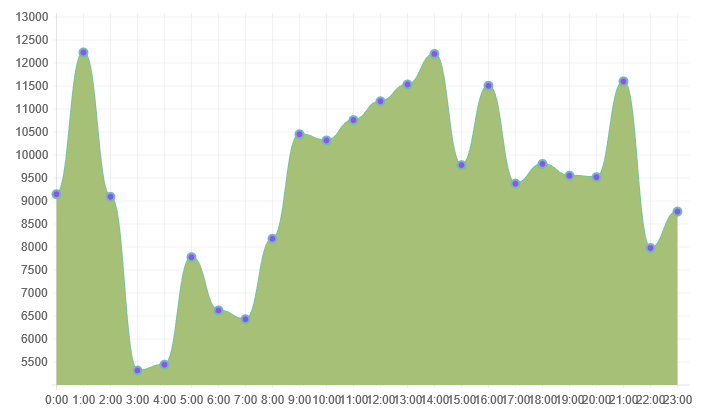
A rather interesting statistic is regarding the time of those request. Of course they seem to be randomly distributed, but one can surely detect a pattern. It is easy to correlate this data with the origin countries and normalize it according to their respective timezone. This has not been done here, however, the result is similar (but without the strange peak at e.g. 1 in the morning).
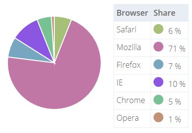
Finally it is really interesting to know what kind of browsers is being used the most. There are official statistics, however, these statistics rarely apply to such a special case as this homepage. As the audience is rather technology aware, a state of the art browser is used. It is worth noting that IE placed second. Probably all the Opera requests are from me personally - well, maybe there are more Opera users ;) (this would be a great case for an evaluation using correlations again).
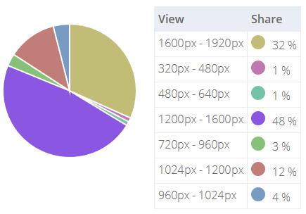
Also the view has to be rather big. Let's have a look at the data provided for the view sizes. Is it really worth designing for mobile as well? Well, it is, but it is certainly not worth doing a mobile first website in the given context. Generally this may be different, but in this special case that's the way it is.
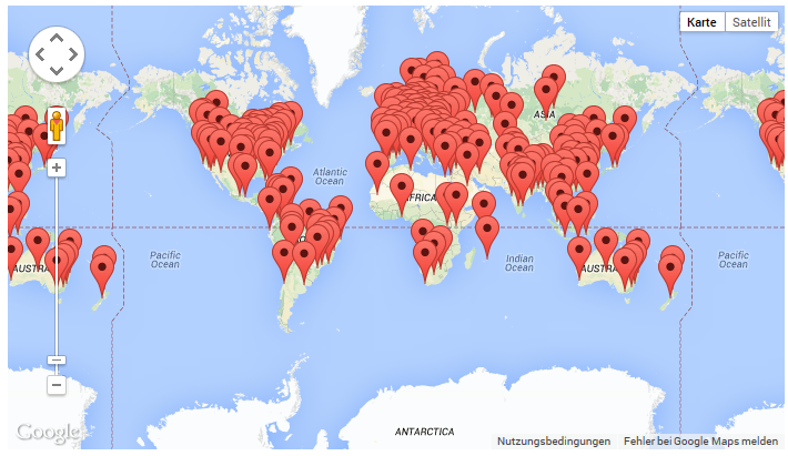
And to conclude... The world map! It does not contain all users - only those for a certain timespan. Also I binned users within a range of &sqrt;2 degrees. The reason is quite simple: JavaScript is out of memory / the Google maps component does simply stop working with too markers. There are limitations! ... but as long as we can fight them with algorithms or simplifications we are good.