My new homepage is not just redesigned, but also re-engineered. I simplified some things and made others a lot more complicated. I think that the changes were required to provide a webpage that is fast, yet extensible and serves multiple purposes (multi-language, my academic background as well as my programming background and a bit of leisure activities etc.).
One of the most important additions was the integration my own statistic system. All in all I am gathering a lot of data. Some extrapolations is forecasting around 500 MB of data at the end of the year (does not sound like a lot, but considering the size of one entry and the total size of my webpage, this is actually a lot). But what is this data all about?
Before anyone starts worrying - it is nothing like Facebook, Google or other big sites are doing. It's probably not even as much as standard web analyzing tools are providing - but it is more specialized. What does this mean? Well, I (hopefully) get the information that is interesting for me, i.e. the kind of information which helps me improving the webpage.
Let's start with some trivial, but very interesting statistics. The average browser usage per session:
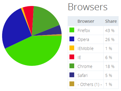
As we can see Firefox is pretty strong. This has probably to do that most of my webpage's users are Germans with a strong technical background. This can be seen by the following statistic:
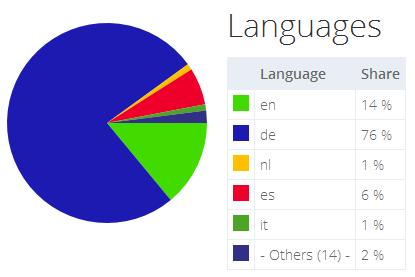
We see the default language set in the browser by the user (or by the system if the user did not modify the browser's setting). Not surprisingly we have a peak at the German language. All other users are viewing the English version of the webpage.
Coming back to the issue of various browsers: What is interesting is the missing dominance by Google's Chrome. Obviously Chrome is used more often than Microsoft's IE or the other Webkit based browser Safari, however, it is not used as often as other (more famous) statistics are showing. Surprisingly (and I'm glad about this fact) Opera is being quite strong here.
So mainly targeting Firefox and Opera is a logical step then - since Chrome seems to play quite nicely anyway. Also adjusting the webpage to work nicely together with Microsoft's IE is a lot more effort. So excluding IE seems like a possible way around considering the low rate of users.
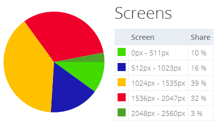
Knowing the target platform (browser and resolution) is a key factor in web development. Therefore the next two statistics are giving me really important information. First the screen resolutions used in the last month:
And now the corresponding view sizes:
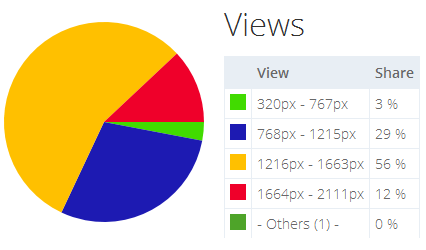
Why do I distinguish here? Well, excluding the obvious case of using the window in a non-maximized way, we have chrome from the OS or browser. The former appears as borders (top, bottom, left, right) or window functions (title bar, buttons, ...) while the latter is visible by the address bar, quick navigation buttons, favorites management, etc.
Therefore the view size is much more important for me. We can see that most people use quite standard desktop systems. Only 3% of my visitors use smartphone like system (wasn't so bad spending a few minutes on the responsive design anyway).
Until now I didn't show you anything that is really special about my analytics. Why should I get any useful information at all? Isn't the information presented above kind of standard? Yes, obviously it should be (and kind of is). But now I'll show you how my most important data can be presented:
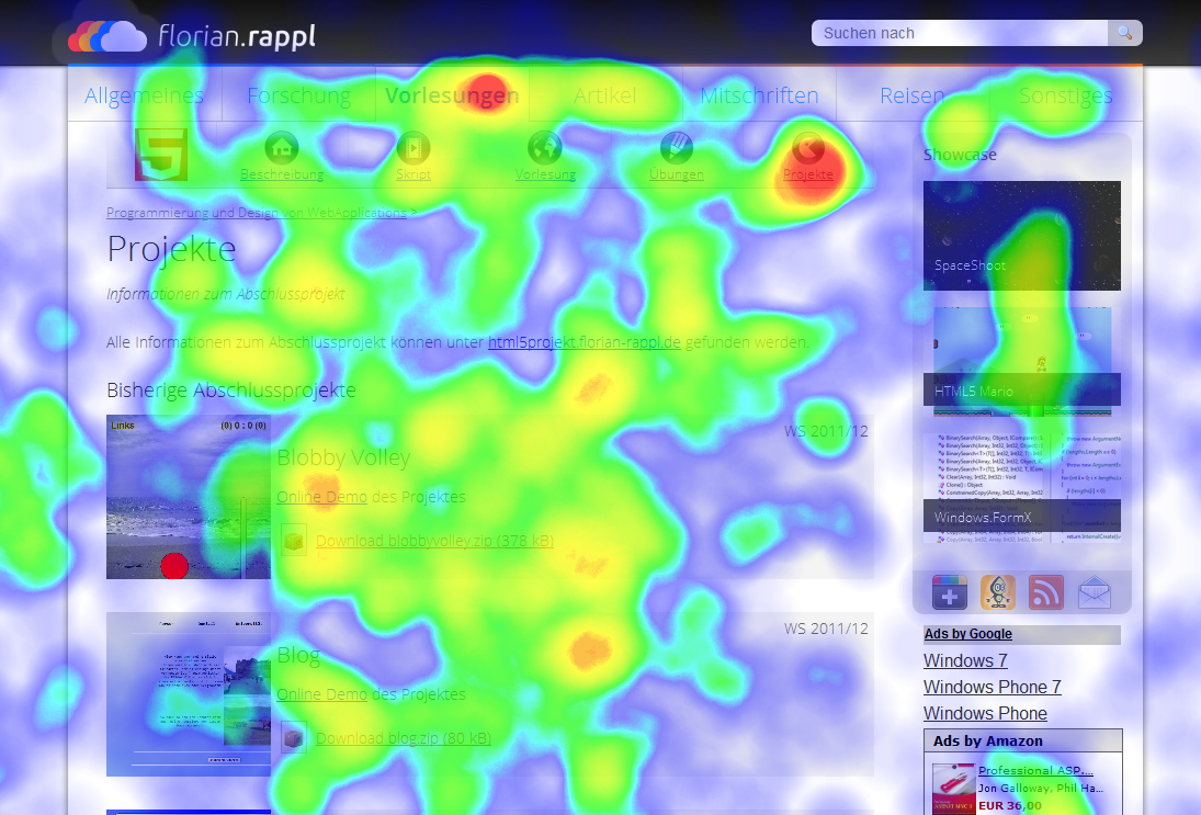
This screenshot shows a webpage in a heatmap aggregate mode. It displays the usage by all users. Red areas are frequently visited by the mouse cursor while blank areas aren't used at all.
With this kind of information I have a direct way of seeing what users do want from the webpage. What kind of menu entries are interesting? Are the ads interesting or should I place something different there? Is my placement motivating users to explore my homepage?
Some of those questions cannot be answered at this point, but for most I do have an educated guess to offer right now. Other analytic tools that have been built upon the data (like this heatmap) will be presented another time.