I downloaded my copy of Windows 10 in the morning of the release. But then I wanted to wait until my official upgrade was ready. It took some time, but just a week after the official release my download was available and I could start upgrading.
Of course I wanted to keep everything and after a quite joyful, but not very innovative, nor very customizable or short, installation experience my system was running Windows 10. Some things that got my attention:
- The start menu is nice. But I still like the start screen. Hence I immediately switched. Looks even better than in Windows 8.
- The login screen is also much nicer.
- The look is super nice in general. I like the new chrome, and the new icons.
- Search seems to be even more useful now.
But that's it. Since I am using the Opera (Beta) browser, I wanted to give Edge a chance. I fear, however, that Edge has too many flaws in its current state. It also feels much slower than Opera. I guess JavaScript performance isn't everything. Also where are plugins?
The only thing that sucks even more is that Opera (is it their fault?!) uses the standard system controls. They look terrible! The checkboxes, the scrollbar, ... - they all looked much nicer in Windows 8. What happened there? Edge uses new, fancy controls. Is it a problem in the Windows internals, or is Opera just using the wrong (outdated?!) headers. I don't know, but it annoys me.
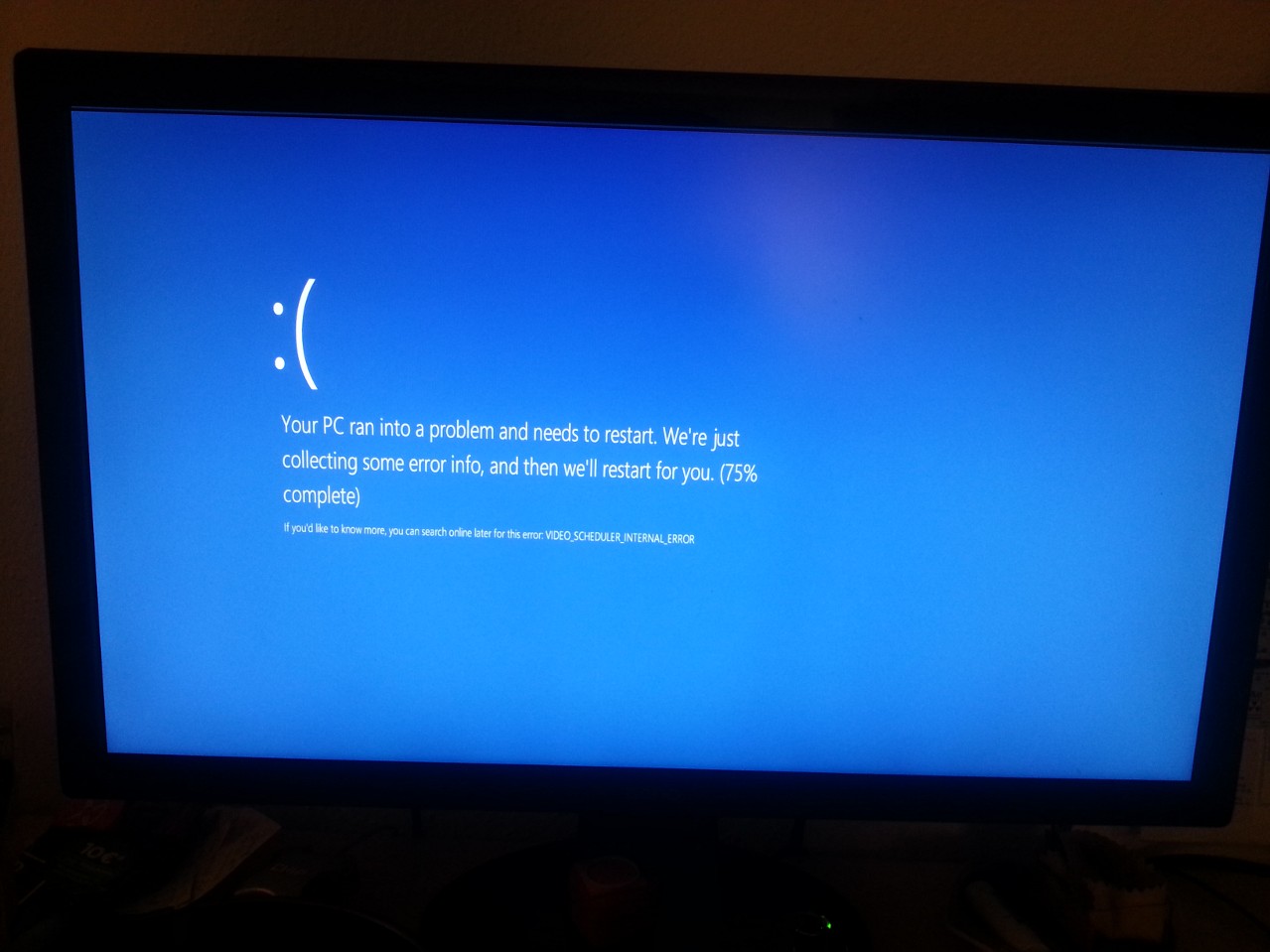
Okay, two hours after the upgrade I browsed some website when (no flash was running - I swear!) the following screen greeted me.

Needless to say that something like that might happen. But after 2 hours? Destroyed my confidence in this upgrade immediately. Maybe something with the video driver? But it is the most standard Intel chip one can find. If that's not working then I guess 60% of all devices may run into problems.
At this point it was time to try the new apps. I feel relieved that the new store, the improved video and music players and especially the wonderful weather app are much superior than their ancestors. But - the mail program is a joke. The previous mail program was already a joke and I hoped that the nice new look and the improved editor will finally create a create application. Spoiler: They did not. It all starts with the first start experience. I had to enter all my accounts again! Is that a joke? That was one of the benefits. No matter what PC I used, my accounts traveled with me. Upgrade from Windows 8 to Windows 8.1? Accounts are there. New installation on a different device? My accounts are already added. Now this... How disappointing!
But the list goes on: The auto-correction is as annoying as before. Changes German words (even though spelling was set to German explicitly) to some close English candidates. I don't know how many "sloppy" e-mails I've written due to that feature. Also: The previous client did really get e-mails quickly. And most importantly: I could see how many e-mails I got at which account at a glance. With the new client I have to click through all accounts, just to realize the one hasn't been synced for half an hour. Pretty disappointing.
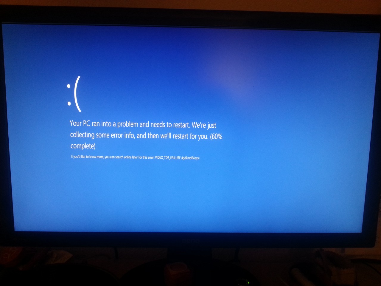
A finally. Just a couple of days later the second blue screen. Now I had as many blue screens in less than 2 weeks than I had in the last 5 years. Great job!

Alright, some nice words for the end. It seems that really all programs still run. Wonderful compatibility. Also the new calender is much better and has a nice interplay with the accounts set in the mail app (thank god!). Also the overall performance is great, and little things like one-get are super useful.
Now Microsoft you only need to do two things: Fix these bugs and respect my privacy. Your default settings are not very polite.